Thursday, October 21, 2010

The Classics - Kamandi #1

This particular issue of Kamandi really shocked me when I bought it - though not for the reason you think.

I didn't buy this issue when it was first published (the cover date is October-November 1972), though I'm not sure why. I generally bought everything Jack Kirby wrote or drew. Perhaps the issue was sold out by the time I got to the local newsstand, or perhaps I didn't have enough money. (I know, it only cost 20 cents - but that was a lot of money to a kid in school!)

Perhaps it's because I wasn't a big fan of Planet of the Apes, the obvious inspiration for the comic (although Kirby denied ever seeing that movie).

At any rate, it was years later that I made the effort to track down those old issues I had missed. I remember finding this one in a local comics shop incredibly cheap - it was priced at a dollar.

I picked it up, took it home, opened to the first page, and there was the shock. At the bottom of the page, the issue was (apparently) autographed by Kirby!

You can see it in this scan - and of course, there's no way to know if the signature is real of faked (although it certainly looks like Kirby's writing). I wonder to this day how someone could let this slip through their fingers? Was it an accident? Did they just not care? Had they forgotten? Is it a forgery?

I was never fortunate enough to have met Kirby, so I like to think it's real - a slender connection to one of the greatest artists in comics history.

Getting back to Kamandi - the comic tells the story of "The Last Boy on Earth," who finds himself in a post-holocaust world filled with all kinds of marvels (no pun intended) - including talking animals, mutants and incredible monsters.

It gave Kirby a chance to let his imagination run wild, and the comic is as big and over-the-top as possible. It's not too deep, but it sure is broad and loaded with action.

I find it funny that this comic - which I consider one of Kirby's lesser efforts - ended up being the longest-running title of those he created for DC in the '70s. Shows what I know!

But despite its shaky premise, it's a comic well worth tracking down - after all, Kirby could have made the phone book exciting.

And Kamandi was always good for a surprise or two.

Grade: A-

-------------------

Wednesday, October 20, 2010

No New Comics Today?

No comics for me today! I spent the day taking my Mother to the doctor's office for a minor procedure, but by the time I got back home the comics shop had closed - so I'll have to go tomorrow.

Oh, and Mom is doing great, so all is well.

Sorry for the delay - this means I'll have another "Classics" review for you tomorrow, and then hopefully we'll be back to some new issues afterwards.

The Classics - Ka-Zar #14

One of the great unsung writers whose comics career got started in the '70s is Doug Moench.

An amazingly prolific writer, he turned out a vast number of scripts, especially during his early days at Marvel - and while every script might not be a classic, he had a very high batting average.

One of his tactics was to take each comic he wrote into new and unexpected directions, and a great example of that can be found on his run on Ka-Zar. His first issue is #14, which is cover dated February 1976.

The character is Marvel's version of Tarzan, right down to the fact that he's a wealthy English Lord in the civilized world and a brutal barbarian in the jungle.

Thee are a few differences - Ka-Zar is friends with Zabu, a sabretooth tiger, and he lives in the Savage Land, a jungle that somehow flourishes in Antarctica and is home to countless dinosaurs and prehistoric creatures.

After 13 issues featuring the usual battles with dinosaurs and savage creatures, the comic was turned over to Moench, and he immediately turned the series on its head.

He loaded it with all kinds of fantastic menaces and unusual settings. He brought in Klaw, the master of sound, to be a powerful opponent for our hero. Moench took Ka-Zar out of the Savage Land - first bringing him to civilization, and eventually to another dimension, complete with flying sharks, barbarians and super science all duking it out for supremacy.

This first issue teams Moench with Larry Hama, who is a darned good artist (these days he focuses largely on writing). He turns in solid work here, although the thin inking style doesn't go well with Hama's strong pencils.

After this issue, Val Mayerik would take over, and his unique, organic style was a good match for Ka-Zar.

I wish I could say that this series was a big hit, but actually it only ran up to issue #20, and then the series was canceled in mid-story. Perhaps the story was too weird (and it was odd), or maybe it was just too much of a change for most readers - but for whatever reason, the story was shut down and ends on a cliffhanger!

I don't remember if it was ever properly wrapped up - I seem to recall a quick recap being posted in a comic somewhere, but I don't remember where.

It was a shame, because the series was lots of fun and unlike anything being published - Moench, Mayerik and Hama were really kicking out the stops on this series.

That's the danger of swinging for the fences - sometimes you hit a homer, and sometimes you strike out. This series may have been cut off before its time, but it was certainly a fun, glorious and entertaining failure.

Grade: B+

--------------------

Tuesday, October 19, 2010

Magnus, Robot Fighter #2

With the second issue, the creative team behind Magnus, Robot Fighter seem to have a better handle on the feel and direction for this comic.

This issue starts in the middle of a big fight scene, as Magnus finds himself up against some big opponents and overwhelming odds.

The issue is loaded with action sequences but doesn't skimp on the characterization, either. We learn more about Leeja Clane, a tough and willful woman who puts herself in harm's way in order to shut down an operation that deals in slavery and worse. We also see that Magnus is a smart fighter, and doesn't just rely on his steel-smashing strength.

I like the relationship that writer Jim Shooter is building between the two. In the original series, they were almost instantly romantically involved, but here there's more tension and playful banter - we're not sure if they'll end up together or not.

The action is a lot more gritty than the original version of this character, as he has to face down all kinds of creatures - not just killer robots.

I like Bill Reinhold's art for this comic. It's loaded with detail, great character designs, sexy women and a futuristic world that seems to be real.

So far the comic manages to walk the thin line between being too dark and too light. It definitely has the feel of those early Valiant issues.

I'm enjoying the series, so here's hoping that balancing act continues!

Grade: A-

----------------------

Monday, October 18, 2010

Warlord of Mars #1

Since I'm not a completist when it comes to buying comics, I tend to be immune to the "alternate cover" scheme, whereby comics companies release a title with several different covers, in hopes that collectors will buy 'em all.

I generally just pick the cover I like best (or whichever one's cheapest, if there's some kind of "rarity mark-up" involved), but I trust you can understand, gentle reader, why I chose this eye-popping cover by J. Scott Campbell, even if he has made the (common) error of giving Dejah Thoris a bellybutton (she's not a mammal - she was hatched from an egg, like most Martians).

It seems fitting that this comic would have an eye-catching cover, since it was the Frank Frazetta art on the cover of A Princess of Mars, the Edgar Rice Burroughs story released in the '70s by the Science Fiction Book Club, that got me interested in the original stories.

Now the Warlord of Mars is back in the spotlight (thanks in no small part to an upcoming film adaptation, I presume). Here we have something of an introduction to the characters in sort of a prequel to that first adventure.

We meet John Carter in 1866 as he tries to make his fortune out west - only to discover that the War Between the States still affects his life. Half the comic is about his struggles and the other half is about his future ally, the giant Martian named Tars Tarkas.

It's a pretty thin intro as written by Arvid Nelson, but then it only costs a dollar, so it's difficult to complain. It's all about setting up the story to come, and it does that well (and I enjoyed the reference to a certain character played by John Wayne).

The art is by Stephen Sadowski, and it's quite good, with a vivid, painted look to it. However, the action does get a bit gruesome, so I wouldn't recommend this for young kids.

It's too early to tell how faithful this adaptation is going to be, or if the creative team plans to follow its own path - but for an intro, this is pretty good. And the price is right (especially if you can find this cover).

Grade: B+

--------------------

Sunday, October 17, 2010

Thor The Mighty Avenger #5

I have to send thanks to my friend Pete for recommending this version of Thor - I had somehow passed it up, but luckily I was able to pick up the issues I'd missed in a single visit to ye olde comics shoppe.

Thor The Mighty Avenger is a series set in its own reality, so it arrives without the usual truckload of continuity behind it - instead, it's rolling out the story of Thor's adventures on Earth a little at a time.

And there are some key differences from the original Thor. For example, there's no Don Blake alter ego - when Thor first shows us at the museum where Jane Foster works (she's not a nurse or doctor here), his powers are gone and his memory is fragmented - he doesn't remember why Odin sent him to Earth.

I really like this story by Roger Langridge - it's a fresh look at the Thunder God (who seems much more down-to-Earth and less godlike in this version), his supporting cast and the other heroes and villains he meets. As the Ultimate universe shows (when it works), it's often liberating to lose all the history and start with a clean slate.

I also like the artwork by Chris Samnee. It's not a Kirby riff, but he has an energetic style with great layouts, terrific character designs and a real sense of fun spilling out of every page.

This issue involves a meeting with Namor, the Sub-Mariner, and it's loaded with surprises. And let me just say how happy I am to see a writer who has a grip on Namor's character - it's been far too long.

So, if like me you've been missing this one, you might want to give it a try. It's a comic that really captures the Silver Age sensibility with a modern storytelling style.

Thanks again for pointing this one out to me, Pete!

Grade: A

-------------------

Saturday, October 16, 2010

Superman #703

As Superman's "Grounded" series continues, readers are no doubt still wondering whether or not the idea is working. (OK, perhaps that should be "I'm still wondering").

That's because, for the third issue in a row, not much happens. Well, that's not quite fair - Superman has a conversation with Batman (Dick Grayson), and then has a big fight in the middle of a small town.

But if this series was supposed to reveal hidden sides of the Man of Steel, or provide a different kind of story, than so far it's just not getting it.

Perhaps Superman's too powerful for these kind of "street-level" stories. They're fine once in a while, but a steady diet of them is, so far, just a bit on the boring side.

The art is good, and Eddy Barrows and J.P. Mayer have a good command of expression and anatomy, but the action sequences are disjointed, with no real flow from panel to panel.

The series just feels... disappointing so far. I'm usually patient with an attempt at something different, but so far J. Michael Straczynski's efforts here are just so-so.

I was hoping for exceptional.

Grade: B

-------------------

Friday, October 15, 2010

The New Avengers #5

Well, I'm feeling a bit conflicted with this issue of New Avengers.

One the one hand, I'm really enjoying the focus on Dr. Strange (one of my all-time favorite characters). But on the down side, not a whole lot happens this issue.

The previous issue set up a conflict between Dr. Strange and Iron Fist, who had (somehow) survived a visit to another dimension and an encounter with the Doc's teacher, the Ancient One.

Only... it seems that we weren't getting the whole story there, which makes the whole setup something of a cheat. We get a few teasers about the true origins of the Eye of Agamotto, a key icon for the Earth's Sorcerer Supreme, we get set up for a major battle, and then the issue ends.

So, it's not a bad issue, it just seems a bit... off. Lots of great dialogue, some clever bits of business, but it still comes off as a pause between Acts.

The art is still terrific, as Stuart Immonen and Wade Von Grawbadger continue to do outstanding work - but they just get a few chances to shine, since it's one of those talk-heavy issues.

Next issue wraps up the story and promises a big event, so I trust we'll be back in the "A" column then. But for now, it's sadly just a "B."

Grade: B

-----------------

Thursday, October 14, 2010

Batman: The Return of Bruce Wayne #5 (of 6)

After a bit of a stumble last issue, this issue of Batman: The Return of Bruce Wayne brings us back to the top.

But before we look at the story, I have to say how fantastic the art by Ryan Sook is (with inks by Mick Gray). His lush, stylized work is perfectly suited to this "film noir" storyline, with great use of shadows, craggy-faced henchmen, beautiful women and the ornate settings around Gotham City.

Which makes it a shame when, 22 pages in, a different artist takes over. That's no slam on Pere Perez, whose style matches reasonably well with Sook's - it's just a bit jarring when styles change in mid-stream. It's a problem this mini-series has experienced before, and it seems to be a curse that's following writer Grant Morrison around. (I'm looking at you, Final Crisis.)

There's certainly nothing wrong with the writing here - Morrison seems to be having a lot of fun playing with the "hard boiled detective" genre here, as Bruce Wayne awakens in a hospital bed with no memory of being shot or traveling through time, and quickly finds himself involved in the mysterious schemes of a beautiful woman.

The story is really picking up speed now, as we see the answers to some puzzling earlier scenes and we start to understand the depths of Darkseid's reasons for launching Batman through history.

Despite the art problems, this is an excellent series - hopefully the wait for that final issue won't be much longer.

Grade: A


----------------

Wednesday, October 13, 2010

Comics on a Wednesday

Here's what I picked up today:

- Adventure Comics #519 - I like the Atom backup feature. The Legion's good, too.

- The New Avengers #5 - An Avengers mash-up.

- Batman: The Return of Bruce Wayne #5 (of 6) - Batman is a dick? (As in detective - get your mind out of the gutter!)

- Doc Savage #7 - Danger in the Desert!

- Green Lantern #58 - All kinds of colors at work here.

- The Invincible Iron Man #31 - Tony goes for a drive.

- Irredeemable #18 - Dealing with an alien invasion in a very unusual way.

- Magnus, Robot Fighter #2 (of 4) - Taking on an army of slavers.

- Superman #703 - Walking through Cincinnati.

- The Thanos Imperative #5 (of 6) - Closing in on a big conclusion.

- Thor #616 - Big trouble afoot.

- Thor The Mighty Avenger #5 - I'm late to this series, but catching up.

- Warlord of Mars #1 - I'm a big fan of the original book - here's hoping the comic lives up to it!

And that's it - a big week!

Tuesday, October 12, 2010

The Classics - Batman: Legends of the Dark Knight #1

Back in September Nate suggested a review of Batman: Legends of the Dark Knight - and we certainly try to cover requests like that here at Chuck's Comic of the Day, so let's take a look at the first issue in that (darned impressive) series!

It's an issue that's so important, it has two covers! The outer one (up there on the left) touts this as the first new "solo" Batman book since 1940 - which is pretty amazing, since the cover date on this issue is November 1989!

These days, hardly a week goes by without a new series starring Batman. (But I digress.)

And of course, in true '80s fashion, the comic was issued with four different colors (though I only picked up one - with two young kids at the time, I wasn't made of money!).

The inside cover (that's it below on the right) was the first of five themed covers (one for each of the first five issues in the series), each one featuring a different mask.

DC certainly lined up its "A" team for this book, with writer Dennis O'Neil, one of the best writers to ever work on Batman; penciller Ed Hannigan and inker John Beatty, both outstanding and vastly underrated artists.

The story takes us back to the very beginning for Bruce Wayne's crime-fighting career as he faces death atop an icy mountain in Alaska. As the story unfolds, we see how his experiences there influence his life and his strategies.

This issue actually makes a solid companion piece to Frank Miller and Dave Mazzucchelli's Batman: Year One, although this is a more spiritual story - but it is crafted to fit into place without disrupting that story (which was issued two years before).

The five-issue series follows Batman's growth as a new hero in Gotham, and it's interesting to see a hero with great ability - but some lingering uncertainty. It's the human side of the hero that we rarely see - but one that O'Neil excelled at.

And I want to emphasize the great art on this series. Hannigan was probably best known for his cover work, but his comic art was strong and original, with dynamic layouts, clear storytelling and excellent "acting" by his characters.

And this was just the first story in a long run - LotDK ran for more than 200 issues and seven annuals, with a majority of those issues featuring some of the industry's top talents.

There are quite a number of outstanding stories in the series - just ask Nate!

Grade: A

------------------

Chaos War #1 (of 5)

It's nice to see Hercules back from... well, wherever they've been hiding him for the past five (or so) months.

He returns to Earth at an opportune moment, just as Marvel's reality is about to be attacked by the god-killing Amatsu-Mikaboshi, who is going by Chaos King (which is much easier for me to type, so I'm all for it).

The series actually starts with a shocking death, as a character who has been around since the mid-'60s is taken down. From there, it just gets bigger and badder as Hercules uses his newfound-and-even-more-godlike power to assemble a vast array of heroes to try to stop the Chaos King.

Writers Greg Pak and Fred Van Lente have this series off to a vicious start, and so far, it's outstanding.

The story is well suited to Khoi Pham, here working with the legendary Tom Palmer, and together they provide a unique art style that is both organic and dynamic, as power and intensity just sings through each page.

(By the way, be sure to pay close attention to the sound effects used - some are very funny!)

So the Chaos War gets off to a good start here. I won't complain about all the upcoming tie-ins, because I've made that point many times before - but I'll definitely be following the main title. It's shaping up to be good fun!

Grade: A-

-------------------

Monday, October 11, 2010

S.H.I.E.L.D. #4

(Almost back to normal, everyone, and so are the reviews.)

As I've mentioned before, writer Jonathan Hickman has been criticized for the fact that his stories are complex and sometimes difficult to follow. For that reason, they're not for everyone, but for those readers with the patience and the desire to sort out the puzzle, his stories pay great dividends.

Nowhere is that more true than with S.H.I.E.L.D.

This story spans centuries, includes famous historical figures in quite unexpected ways, and mixes in healthy doses of Marvel's cosmic tapestry. The end result is a real delight, if a very improbable one.

In this issue we have Leonardo da Vinci, one of the key architects of the organization (which may or may not be related to the modern-day SHIELD), somehow turning up alive in 1956 to take part in a cosmic event.

Also taking part in events is an immortal Isaac Newton, whose motives seem quite dark, and other famous names that I won't spoil here.

It's great fun to follow along as Hickman continues to weave his story, revealing events slowly and carefully. There are also some "Easter Eggs" for longtime fans to enjoy.

The story is well served by the amazing art of Dustin Weaver, who provides images with breathtaking scope and amazing detail.

This comic isn't for everyone, but if you liked Lost and The DaVinci Code, you'll probably get a kick out of this, too.

Recommended!

Grade: A-

--------------------

Sunday, October 10, 2010

Lady Mechanika #0

(Still under the weather folks - though doing a bit better - but here's another short review.)

This is a comic I picked up on a whim - I'm not really a fan of steampunk, though the designs certainly are impressive and fun.

This preview issue of Lady Mechanika gives artist and writer Joe Benitez lots of opportunities to take us deep into this steampunk reality, set in 1878.

We meet the title character, a beautiful woman who is hunting demon-like creatures - but she finds a lot more than she bargained for.

Benitez's art is terrific (if a bit dark and muddy here), and he's equally at home with the incredible detail of this reality and the action sequences. And of course, he's one of the best when it comes to drawing beautiful, sexy women.

Since this is a preview, it's short and to the point, but it's a good introduction to the character. If you're into steampunk, you'll definitely want to check it out.

Grade: B+

------------------

Saturday, October 9, 2010

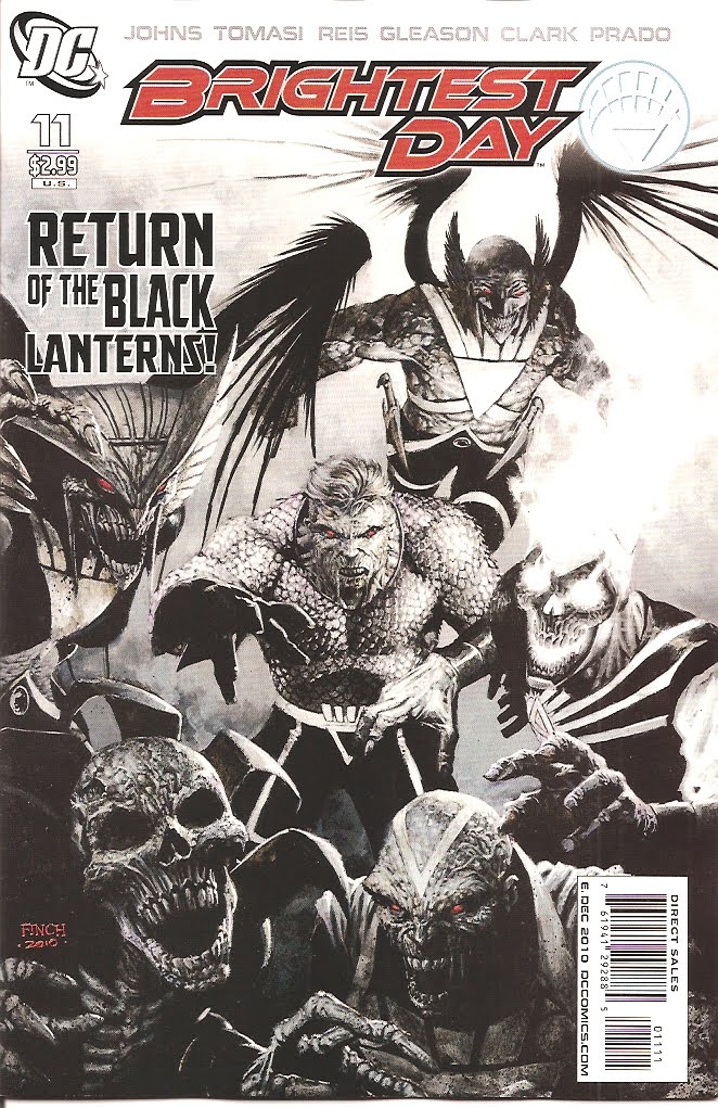
Brightest Day #11

I have to admit that I'm feeling under the weather today, friends (apparently something I ate is fighting back with a vengeance), so this is going to be a short review.

Brightest Day continues to focus on the return of Silver and Bronze Age heroes, and while it's nice to see Aquaman and the Martian Manhunter back in action, but the story just seems to be stumbling badly, with lots of fighting and yelling and not much in the way of actual story or explanation about what's happening.

As the cover indicates, this issue sees the return of (some) Black Lanterns, and that's disappointing, too - as villains, they're no real challenge to the heroes. Just set 'em up and knock 'em down.

The art's pretty good, if uneven. We're 11 issues in, and the story is still awfully muddy. Again, it's great to see these characters return (that was long overdue), but we need more than that.

Grade: B-

-----------------

Friday, October 8, 2010

Ultimate Thor #1

These days Marvel's in the middle of a Thor overload. But that's to be expected, since the Thunder God is starring in an upcoming feature film (which hopefully will live up to the trailer released several few weeks back).

In addition to the real Thor, we have assorted mini-series, specials, alternate reality versions and now, Ultimate Thor gets his own comic.

And let me just say up front that, as much as I like Bryan Hitch's original design for the character, the giant hammer is just too over-the-top. It's completely impractical and almost comical.

OK, now that I have that out of my system, I have to say that I enjoyed this comic quite a bit. Jonathan Hickman (who seems to be trying to take over the "I write everything at Marvel now" title from Brian Bendis) turns in an excellent script here, as we jump around in time from "Eons Ago" to 1939 and into modern times.

We see Thor and his comrades facing powerful opponents in Asgard, we see the growing menace from a familiar Nazi face, and we meet a confused guy who thinks he's Thor in today's world. Oh, and we also meet Dr. Donald Blake.

The story's just beginning, but it's already got its hooks in me, as we see characters and settings that are familiar - yet very different at the same time.

The artwork by Carlos Pacheco is outstanding. He jumps with equal ease from brutal battles to clinical discussions with a fluid and powerful style that's well suited to the roughshod ways of the Asgardians.

I've often said that Ultimate Spider-Man is a better comic than Amazing Spider-Man. It's too soon to say the same about this comic as compared to the regular (and formerly Mighty) Thor comic, but I will say this: it's on the right track.

But I still think the hammer's silly.

Grade: A-

------------------

Thursday, October 7, 2010

Uncanny X-Force #1

I think I'm genetically disposed toward buying first issues of X-Men-based comics. But even with that, I go into this first issue of Uncanny X-Force with low expectations.

What I expect from this issue is lots of grim and gritty action, a dark tone and lots of death and destruction. If anything, the issue was a bit toned down from that.

It's certainly dark. This team is (essentially) a Black Ops team working to bring down the big menaces as quickly as possible.

The team is led by Wolverine (natch) and includes Psylocke, Deadpool, Archangel and Fantomex, all dressed in their darkest (and virtually colorless) costumes.

Written by Rick Remender, the story centers around the team's efforts to track down a newly-resurrected villain, which brings them in conflict with a powerful entity - and each other.

But for a first issue, here we get mostly setup and very little actual story advancement. The issue's big reveal is mostly an anti-climax, and the story mostly centers about introducing the characters and sending them up against some (mostly) lame bad guys.

The art by Jerome Opena is solid, with some great layouts, good character designs and fun action scenes - but it is overwhelmingly dark and grim, and a few panels are a bit tough to make out.

So will I buy future issues? I might go one or two more issues to give the team a chance to get their "sea legs" - but I hope future issues have a bit more story packed in there.

Grade: B

---------------------------

Wednesday, October 6, 2010

Comics Day Again

Here's what your pal Chuck picked up at the comics shop today:

- Avengers Academy #5 - the focus this time around is on the lightning-powered Striker.

- Batman Odyssey #4 (of 13) - what an odd book this is turning out to be.

- Brightest Day #11 - Not the Black Lanterns again!

- Chaos War #1 (of 5) - Nice to see Hercules back in action - and a surprise death kicks off the issue.

- Lady Mechanika #0 - just for the heck on it.

- SHIELD #4 - the mystery deepens.

- Tom Strong and the Robots of Doom #5 (of 6) - battling an army of killer robots.

- Ultimate Thor #1 - more Thor, more often!

- Uncanny X-Force #1 - just can't pass up those X-Men-related first issues.

The Classics - The Brave and Bold #57

I wish I could remember what I thought when I saw this issue at the newsstand late in 1964, but I must have been amazed. The first appearance of Metamorpho had to be the most un-DC-like comic that company had ever created.

Here was a hero who wasn't handsome or particularly clean-cut. In fact, he was downright gruesome and managed to be both tragic and comic at the same time.

Even the art and writing was an unusual mix. The story by Bob Haney (uncredited here) is mostly serious and straightforward (with some comic banter by the hero), but the art by the incredible Ramona Fradon is fantastic and often comical.

Her character designs are stunning, including the bizarre Element Man, the beautiful Sapphire, the brutish Java and the cartoonish Simon Stagg.

The story is straightforward: adventurer Rex Mason works for Stagg, a wealthy scientist. Mason's also in love with Stagg's daughter, Sapphire. Mason searches a pyramid for the Orb of Ra and finds himself in an ancient trap, entombed with a meteor that radiates power.

He somehow survives but is transformed into a strange new form. He finds he's able to change his body into other elements - magnesium, cobalt or hydrogen gas, to name a few. It's a terrific visual gimmick, and Fradon makes the most of it, bending his body into numerous strange shapes.

Even his name is out of the ordinary - I sure had no idea what a "Metamorpho" was. And he actually doesn't receive that name until the next issue!

So there were lots of reasons why this comic shouldn't have worked - and yet, by some magic (alchemy?), the disparate elements came together and formed an entertaining and energetic comic.

The mixture of dark and comic story elements were irresistible, and this comic (and his soon-to-follow solo title) became immediate favorites.

Unfortunately, the creative teams that followed couldn't maintain the balance between serious and comic adventures, and the comic veered too far into the comic realm - but when it was good, Metamorpho was one of the best.

Grade: A

-------------------

Tuesday, October 5, 2010

Secret Warriors #20

Right on the heels of the dark and impressive "Last Ride of the Howling Commandos" story in Secret Warriors, writer Jonathan Hickman begins what appears to be the final story arc for Nick Fury and his young (but powerful) team.

And this storyline promises to be just as intense as the one before it. Hydra, the Leviathan organization and Nick Fury's agents are taking turns launching devastating attacks against each other, resulting in countless deaths and massive destruction.

I have to say that, even nine years after 9/11, it's still disturbing to see these kinds of attacks depicted. Fury decides it's time to bring the conflict to a close, so he puts a plan in place.

But there are other forces at work, and Fury may have some surprises ahead.

The art by Mirko Colak gives a dark, painted look to the adventure, and I like it a lot. It's not perfect - it's difficult to follow the action in a few panels, and a few of the characters don't look quite right - but that's just being picky.

I've been enjoying this comic a lot, which is somewhat surprising since it focuses on a different Nick Fury - here the Colonel is deadly serious and focused on doing the right thing, even when that means making difficult and life-altering decisions. It's not all jokes, cigars and high-tech trickery - this is a battle to the finish against a powerful enemy and overwhelming odds, and it's tough to see how Fury is going to win this fight.

It's a serious story that this comic has been building to since the first issue, and I can't wait to see where it goes from here. Recommended!

Grade: A

-------------------

Monday, October 4, 2010

Justice Society of America #43

Has DC decided to move the original Green Lantern offstage again?

A decade or so back Alan Scott was renamed The Sentinel and moved to the back burner as the focus was placed on a single Green Lantern (Kyle Rayner). It was writer Geoff Johns who restored the original name and brought GL back to the forefront of the revived Justice Society of America.

But this issue seems to be putting things into reverse. Over the course of an incredibly dry (and frankly dull) conversation between GL and his son Obsidian, we learn that the powerful Starheart (which GL now controls) has erected a home for wayward magical creatures on the far side of the moon.

It strikes me as nothing more than a fancy ghetto for all these beings, but maybe that's just me. At any rate, to maintain this new realm, GL must focus at all times on controlling the Starheart. That seems a lot to ask of anyone - does he ever sleep? Watch a movie? Go on a date? You get the idea.

He also predicts a future event that seems a safe bet for a future crossover, especially since in includes vampires. Here's a prediction from me: I won't be buying it.

The art here is by Jesus Merino with inks by Jesse Delperdang, and while the cities and fantasy buildings are spectacular, the heroes seem to suffer from odd anatomy in a few places.

Look, this is a poor comic that spends a lot of effort setting up a magical environment on the moon, but gives us no good reason to care. GL and Obsidian spend most of the issue whining about recent events, and as a reader I found it really difficult to care.

This issue could have been presented as a short subplot in a regular issue. As a stand-alone story, it's mighty weak.

Grade: C

--------------------

Sunday, October 3, 2010

Captain America #610

While I've been a big fan of most of writer Ed Brubaker's work on this series, I have to say I'm not as enthused about the "Bucky-as-Captain America" stories.

This issue wraps up the latest story as the modern Baron Zemo expends a great deal of effort to taunt Cap with the notion that he doesn't deserve to wear the uniform or carry the name.

As psychological torture goes, this is mighty thin gruel. For those who came in late, Bucky (during World War II) barely survived the explosion that left Cap in suspended animation. Bucky lost an arm and was rescued by the Soviets, who brainwashed him and turned him into the Winter Solider, a covert assassin.

In the present we have Zemo confronting Bucky with the hero's murderous past, all of which is leading up to the next issue, the Trial of Captain America. Let's just hope his trial doesn't last as long as the Flash's did (we're talking years, literally).

While the story didn't impress, the artwork does. Butch Guice is doing some of his all-time best work here, and that's saying something. Powerful layouts, great characters, loads of detail - it's very impresive.

While Bucky has been a good fill-in Cap, I have to admit that I'm ready for the "Real McCoy" to get back into the uniform. I'm all for Bucky sticking around with a different costume and a better hero name, but it's past time for Steve to get back to business.

Oh, and this comic's backup feature was very weak. How about turning that space over to the Falcon or Bucky? (I'm just teeming with helpful suggestions today.)

Grade: B+

------------------

Saturday, October 2, 2010

Powers #6

This is not a comic for just any reader.

For one thing, Powers is loaded with adult content - extreme violence, vulgar language, nudity - it's basically an "R"-rated version of a comic book.

One of the great (and sometimes maddening) things about this series is: you never know where it's going next. The earliest issues combined the gritty detective genre with superheroes, as it focused on Detective Christian Walker and his partner, Deena Pilgrim, as they solved gruesome murders involving superheroes and villains (herein referred to as "Powers").

But things have changed a lot since then. Deena is off the force after a traumatic experience and Walker - still a Detective - has become, in secret, a cosmic protector of Earth.

This issue is a great example of the wide range of story possibilities all this creates, as the story careens from a grisly murder investigation to a trippy cosmic battle to save the Earth.

It's a real tour de force by writer Brian Bendis and artist Michael Oeming. The writing is as sharp and alive as anything Bendis has done (which is saying something), and the art is powerful and intense, and Oeming is equally at home in the alley or in parallel dimensions.

If you're new to the title, I'd recommend looking at some of the collections to see if this is your kind of comic. But if you're able to handle the adult material, this really is a comic you should be reading.

Grade: A-

--------------------

Friday, October 1, 2010

Wonder Woman #603

Now that the furor over Wonder Woman's new costume has subsided and we have a few stories to look over, it's time to ask: how's the "All-New" Diana working?

So far, I'd say it's going well - though it's really not an extraordinary comic book. The stories are a mixture of mythology and modern-day combat, as Diana tries to protect a small group of exiled Amazons from a murderous military force. The comics are very action-heavy, and that's not a bad thing.

This issue is all about a battle between WW and some invisible, soul-stealing Harpy-like creatures called Keres. That leads to a trip to the underworld and a splash page that has to be seen to be believed.

The credits list three different pencillers - Don Kramer, Eduardo Pansica and Allan Goldman - and I'm not sure which one(s) did the splash page, but he must have choked when he saw the description of a few million lost souls rioting in hell. It's one of those scenes that's easy for the writer to create, but the dickens for the artist to envision.

At any rate, the story lunges along briskly and is mostly fun (despite a few shortcuts in logic). We seem to be getting closer to some answers about what happened to the Amazons and why Wonder Woman's life has changed, so that's a positive development.

The art is good (though a bit mixed in this issue), and the writing is strong (though Straczynski is still hiding things from us). If you're into mythology than you'll probably enjoy this one.

I'm not in love with it yet, but I plan to hang around for at least a few more issues to see where it goes.

Grade: B

----------------

Thursday, September 30, 2010

Avengers Prime #3 (of 5)

The first thing you should know about Avengers Prime is that the artwork is incredible.

Alan Davis is one of the top artists in the business, and this issue shows why. Aided by inker Mark Farmer, Davis presents a setting that's filled with magic and majesty, and the kind of power that been all too rare since Jack Kirby left us. He brings Asgard (or rather, the nine realms) to vivid life, and populates it with stunning creatures, heroes and beauties.

Each hero is drawn completely in character - from Thor's righteous anger to Cap - er, Steve Rogers' steely determination to Tony Stark's never-ending smugness, even when stripped naked.

The story by Brian Bendis is played fast and breezy (though with some dark edges), as each hero faces some overwhelming odds. Readers of Thor may find some plot points that seem out of place, given the events in recent issues of his comic, but it's all in good fun, so we can forgive (especially since we haven't seen the whole explanation yet).

As this series hits its mid-point, it's still a lot of fun and - if for the art alone - well worth picking up.

Grade: A-


-----------------

Wednesday, September 29, 2010

A Day for Comics

Yep, it's new comics day, and here's what I picked up today:

- Atlas #5 - The end of the line.

- Avengers Prime #3 (of 5) - Thor goes to Hel - again?

- Captain America #610 - Showdown with Zemo!

- First Wave #4 (of 6) - Welcome to the jungle!

- Justice Society of America #43 - A father and son chat.

- Powers #6 - Interesting range of stories here, from cosmic to street level.

- Secret Warriors #20 - Looks like it's revenge time.

- Wonder Woman #603 - Diana goes to Hell, too!

--------------

The Classics - Brain Boy #6

Today's "Classic" comic is an obscure one that I had almost forgotten about.

A few years back my friend Rolf mentioned it in an email, and it jogged my memory. Brain Boy was a short-lived Dell comic that caught my interest - though I'm not sure why.

The title character is Matt Price, a normal-looking blond hero who wears normal clothes - no super-hero duds for him. Even his powers are (visually) bland - he is telepathic, can control the minds of others and levitate (with some difficulty). He's recruited to work for a secret government agency - and that's about the size of it.

I suspect I was drawn to the comic by the title and the cover painting - but what probably caught my attention was the surprisingly horrific story inside.

The issue was apparently written by Herb Castle and drawn by Frank Springer, although there are no credits listed. Cover dated September-November 1963, the issue is surprisingly copy-heavy - almost a third of each panel is filled with dialogue or captions. Springer's art is strong as always, but he doesn't get much room to maneuver here.

The story begins quietly, as Brain Boy goes on vacation. After several harrowing adventures (in previous issues) he decides to get away from it all, so he travels to a lodge by a secluded lake in Canada.

There he finds the residents acting strangely, carrying out odd missions and resisting his telepathic powers. The mystery revolves around the lake - something about the water seems to sap the will of everyone who comes in contact with it.

It's a story reminiscent of the film Invasion of the Body Snatchers, where the hero can tell everyone's acting strangely but he doesn't put the pieces together until it's almost too late.

There are a couple of genuinely horrific scenes in the story, including one where Brain Boy is in a rowboat on the lake and a dozen residents swim after him like zombies, tying to pull him into the water. OK, it doesn't sound scary when I write it out, but it was scary to my 7-year-old self (and it's still a creepy scene today)!

The secret to the mystery (which I won't reveal just in case someone out there actually manages to track down a copy) is a clever bit of science fiction storytelling, and very effective.

I remember looking for more adventures of Brain Boy after this issue, but I never found one - and for good reason. This was the last issue in the series.

It's probably just as well. Soon they would have put Brain Boy in a standard costume and had him fighting corny villains. Perhaps it's better for his run to have ended on such a satisfyingly creepy note.

Grade: B+

----------------

Tuesday, September 28, 2010

Fantastic Four #583

This title (to a degree) and its author, Jonathan Hickman (to a greater degree) have come under some fire recently, as a recently-revealed comment by a prominent writer indicated that he didn't think much of Hickman's work.

In some ways, it's a fair criticism - Hickman's comics do not follow the typical style set for most mainstream comics.

Comic books are usually straightforward with clear storytelling and easy for new readers to pick up and follow, since (as Jim Shooter said - I think) every issue is someone's first issue.

But Hickman's writing for the Fantastic Four, S.H.I.E.L.D. and Secret Warriors is anything but clear. The stories are involved, convoluted and often confusing. I can't imagine a new reader picking up any of those comics and being able to follow along.

However, for the reader who's willing to follow along, pay attention and dig a bit deeper, the stories are very rewarding. I'm enjoying this title in particular as we see the seeds of past stories start to grow and bear fruit.

For example, the stories of the four cities is starting to spill over into the Marvel universe, as war breaks out between the powerful residents of two cities. At the same time, we see Valeria, the intelligent daughter of Reed and Sue Richards, following a secret plan of her own - one that involves an incredible amount of danger.

This issue is the first for new series artist Steve Epting with Paul Mounts providing the colors, and a terrific team they are. The art reminds me of Gene Colan at the height of his powers, with fluid character flourishes and lots of powerful scenes with cosmic confrontations. Great stuff!

This issue is actually a good jumping-on spot, because it kicks off a new storyline that promises the death of one of the members of the team. Ordinarily that would produce a yawn, but Hickman has proven himself to be good at creating surprising plot twists, so we'll hang on for the ride.

This comic certainly isn't for everyone, but frankly, if you're not picking up this comic - you're missing out.

Grade: A-

-----------------

Monday, September 27, 2010

Avengers Academy #4

Here's where I forgive Avengers Academy for the latest storyline.

Oh, not that it was a great experience - actually, not a lot happens in this issue (other than the team being in a prison for super-villains and almost causing a riot).

But last month I chastised the title for having a crossover with the Thunderbolts so early in its run - but if there is a crossover, it was relatively seamless, as we didn't miss anything since last issue (as near as I can tell).

This issue focuses on Mettle, the crimson teen (apparently) made of steel. His origin is a clever bit of work, and is far more interesting than anything else that happens in this issue.

Mettle works with Hazmat and Veil to track down Norman Osborn (him again?) with a simple goal in mind: they plan to kill him for what he did to them (since their powers all manifested under his guidance).

As always, the art by Mike McKone is outstanding, with strong layouts and great character designs. He stumbles a bit in the riot sequences, where things get too confused - but that's a minor complaint.

I'm enjoying this series, but the whole prison set-up for the past two issues just doesn't ring true. If the Avengers were trying to guide these young people to the right path, why would they expose them to so much potential danger?

I like the idea that this book is (partly) modeled after the original concept of the X-Men - young heroes being trained in how to use their powers - but I get the sense that this comic seems to be struggling a little bit to find its way.

My advice is to get the team out in the field fighting the bad guys - after all, the X-Men didn't spend all their time in the Danger Room.

Grade: B

-----------------

Sunday, September 26, 2010

Justice League of America #49

Looking back over my reviews of this comic for the past couple of years, I've been pretty hard on the Justice League of America.

That's mostly because the comic just hasn't been living up to its potential. It should be the top comic at DC, with the company's greatest heroes taking on major challenges.

But this comic hasn't been living up to that promise for a long, long time - and this issue does nothing to change that perception.

That's because this is apparently a "filler" issue, designed to carry us over to the next issue, which will be #50.

So we have a few cameos with most of the members of the JLA while the majority of the issue focuses on Donna Troy and Jade as they take on a third-rate villain in a distasteful cop-out of a story.

Once again, I wonder, "What happened to the James Robinson who wrote so many outstanding stories?" (Still no good answer to this question.)

The art is by Pow Rodrix with Robson Rocha and no less than nine inkers! The art's not bad, but it's a mish-mash of styles with some odd anatomy here and there.

So when will this comic get its act together? I've about decided that it's a casualty of the ongoing need for events in comics, and since those stories affect the biggest stars at DC, perhaps this comic is destined to continue to be a home for second-banana characters. A shame, really.

Grade: C

----------------

Saturday, September 25, 2010

Thor #615

I approach the latest issue of Thor with lots of hope for the future and its new creative team - but it's tough to judge by this comic. It's really just the first step on the path to wherever the creative team is going.

I don't much care for the framing sequence where a scientist is explaining his theory that something bad is on the way - and we see signs that his prediction is correct. But that's a minor quibble - the character is there to provide exposition that sets up the conflict in the months ahead.

On the good side, we have the introduction of an unstoppable foe, and a glimpse into the beginning efforts to restore Asgard. And Thor has a few heart-to-heart conversations with assorted characters (including himself, sort of).

The best thing about the comic is the artwork by Pasqual Ferry, who provides some stunning images and a nice, ethereal look to the locations, from alien worlds to the ruins of Asgard.

I have to admit that I have never been crazy about some of the ideas introduced in this comic in recent years - running off Odin, placing Asgard on Earth - it all seemed like poorly thought-out snap decisions. Hopefully the new creative team will correct some of these poor choices and get this comic back on track.

The story has a lot of potential, and it's good to see a new and powerful menace being introduced. The jury is out on the story, and so far things are off to a (mostly) slow start, but there's a lot of promise on display.

I'll be sticking around.

Grade: B+


----------------